About
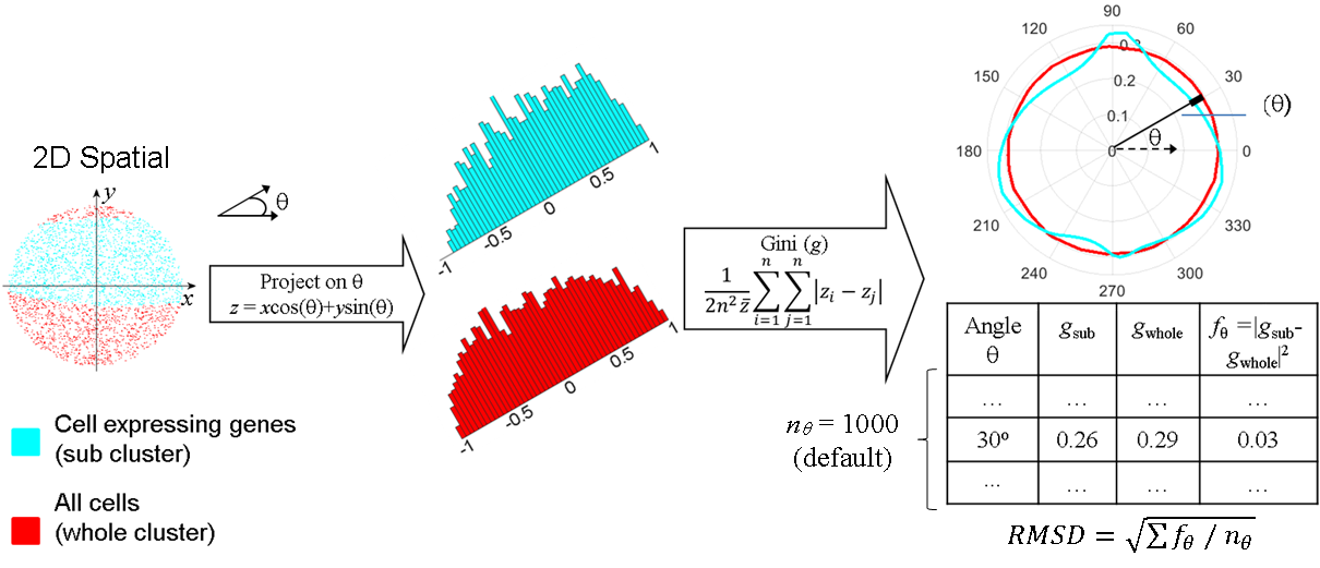
In this work, we design the Polar Gini Curve (PGC) technique, which combines the gene expression and the 2D embedded visual information to detect biomarkers from single-cell data. Theoretically, a Polar Gini Curve characterizes the shape and ‘evenness’ of cell-point distribution of cell-point set. To quantify whether a gene could be a marker in a cell cluster, we can combine two Polar Gini Curves: one drawn upon the cell-points expressing the gene, and the other drawn upon all cell-points in the cluster. We hypothesize that the closers these two curves are, the more likely the gene would be cluster markers. We demonstrate the framework in several simulation case-studies. Applying our framework in analyzing neonatal mouse heart single-cell data, the detected biomarkers may characterize novel subtypes of cardiac muscle cells.
Main idea: A representation combining spatial information and gene expression from single-cell data.
Spatial information includes:
-
Density: how a cell are placed next to each other in the spatial space (i.e. projected 2D coordinate, 2D tissue image).
-
Shape: how the cell cluster looks (boundary) in the spatial space.
-
Gene expression: is used to select an interested subset of interested from the cell cluster
Key techniques:
-
Capturing shape information: project the cell-points onto each angles, from 0, 0.1, 0.2, … 360 degrees (smaller resolution is better)
-
In each angle, compute the Gini index for the projected cell-points.

Cluster specific biomarkers: by comparing PGC of the whole cluster cell-points and PGC of the cell-points expressing a specific gene.
Tutorial
1. Dataset
This tutorial uses the neonatal mouse heart single cell dataset from http://bis.zju.edu.cn/MCA/.
- The processed dataset is at [Supplemental_Data_3-_Neonatal_Heart_Simulation](https://figshare.com/articles/dataset/Supplemental_Data_3-_Neonatal_Heart_Simulation/11933520){:target=”_blank”}
%% load the dataset

coordinate = importdata('coordinate.mat'); %2D spatial coordinate

Expression = importdata('Expression.mat'); % gene expression

geneList = importdata('geneList.mat'); % gene symbol

clusterID = importdata('ClusterID.mat'); % cluster ID


numCluster = max(clusterID); % get the number of clusters
2. Identify cluster
This step could be customized according to each project. Step 1 already contains the spatial and clustering information. To reproduce the result, run
%% This step is optional, to reproduce the clustering and spatial

coordinate = tsne(Expression); %compute the spatial coordinate

kD = pdist2(coordinate,coordinate,'euc','Smallest',50); % find the suitable parameter for dbscan algorithm, with the minimum of neighborhood is 50

plot(sort(kD(end,:))); % plot the parameter graph. It looks like the elbow point 3 is a good parameter

title('k-distance graph');
xlabel('Points sorted with 50th nearest distances');
ylabel('50th nearest distances');


clusterID = dbscan(coordinate,3,50);; % cluster ID
Cluster 1 are cardiomyocytes. Actc1 is a very well-known marker for this cell type https://www.ncbi.nlm.nih.gov/pmc/articles/PMC6249224/. To verify:
gscatter(coordinate(:, 1), coordinate(:, 2), clusterID); % view all clusters


% plot Actc1 expression
marker = 'Actc1';
[~, index] = ismember(marker, geneList);
markerExpression = full( Expression(:, index) );
threshold = 1;
index1 = find(markerExpression <= threshold & clusterID > 0);
scatter(coordinate(index1, 1), coordinate(index1, 2), 15, [192, 192, 192]/255, '.');
hold on
index1 = find(markerExpression > threshold & clusterID > 0);
scatter(coordinate(index1, 1), coordinate(index1, 2), 15, markerExpression(index1), '.');
colorbar;
colormap('jet');
title(marker)
3. Draw a PGC
Here we draw PGC for gene Actc1 on cluster 1.
clusterIndex = find(clusterID == 1); % get all cells in cluster 1
clusterCoor = coordinate(clusterIndex, :); % get the spatial coordinate of cells in cluster 1
clusterLbl = ones(length(clusterIndex), 1); % label these cells as '1'

[~, geneIndex] = ismember( 'Actc1', geneList );
geneIndex = find(clusterID == 1 & Expression(:, geneIndex) > 0); % find cells expressing Actc1 in cluster 1
geneCoor = coordinate(geneIndex, :); %get the spatial coordinate of cells expressing Actc1 in cluster 1
geneLbl = 2*ones(length(geneIndex), 1); % label these cells as '2'

% Draw the PGCs for these two sets of cells
[angleList, allGini] = make2DGini([geneCoor; clusterCoor],...
    [geneLbl; clusterLbl], {'Actc1 cluster 1 cells', 'All cluster 1 cells'});


RMSD = sqrt( mean( abs( allGini{1} - allGini{2} ).^2 ) );; % the RMSD between two PGCs. It is 0.0112 for this case
4. Compute p-value
There are multiple ways to compute p-value for PGC. Here we show the standard way, presented in the original publication. This may need long computational time.
pointIdx = find( clusterID == 1 );
clusterPt = coordinate(pointIdx, :);

boundPoly = boundary(clusterPt(:, 1), clusterPt(:, 2));
boundPt = clusterPt(boundPoly, :); % get the boudary points in cluster 1. This would form a polygon covering the cluster.

numExp = 200;
allRanRMSD = ones( numExp, 1 ); % this store all RMSD in the simulation

for expre = 1 : numExp % randomly do 200 simulations
    close all
    % use the 'random by rejection' method to generate a new cell-point
    % clusters with the same shape and number of points to cluster 1. Search
    % and review the technique in Monte Carlo simulation for better idea.
    xRange = [ min(boundPt(:, 1)), max(boundPt(:, 1)) ];
    yRange = [ min(boundPt(:, 2)), max(boundPt(:, 2)) ];
    backPt = zeros(0, 2);
    while size(backPt, 1) < length(pointIdx)
        randX = xRange(1) + (xRange(2) - xRange(1)) * rand();
        randY = yRange(1) + (yRange(2) - yRange(1)) * rand();

        if inpolygon(randX, randY, boundPt(:, 1), boundPt(:, 2))
            backPt = [backPt; [randX, randY] ];
        end
    end
    backLbl = ones(size(pointIdx)); % 'backPt' forms the new point with the same shape and number to cluster 1.

    forePt = backPt(1:length(geneLbl), :); % randomly select x points (x = number of cell expressing Actc1) from 'backPt'
    foreLbl = 2*ones(length(geneLbl), 1);
    % run gscatter( [backPt(:, 1); forePt(:, 1)], [backPt(:, 2); forePt(:, 2)], [backLbl; foreLbl]) to view the simulated clusters );

    % draw PGC and RMSD for this simulation
    [angleList, allGini] = make2DGini([forePt; backPt],...
        [foreLbl; backLbl], {'fore', 'back'});

    allRanRMSD(expre) = sqrt( mean( abs( allGini{1} - allGini{2} ).^2 ) );
end

hist(allRanRMSD, 100); % this shows where the real RMSD (in this case, 0.0112) is, compared to the simulated RMSD
pVal =  1 - normcdf(RMSD, mean(allRanRMSD), std(allRanRMSD)) % p-value in this case, 4.8137e-12
How to cite us
Nguyen, T.M., Jeevan, J.J., Xu, N. and Chen, J.Y., Polar Gini Curve: a technique to discover gene expression spatial patterns from single-cell RNA-seq data, Genomics, Proteomics & Bioinformatics, 4, 19(3), pp.493-503., doi